FITNESS VIBE
FITNESS VIBE


PROBLEM
In the fitness industry, it's known that having a workout buddy or sharing your progress with others is a great motivator for people to stick with their fitness routines. The goal is to add a messaging feature to their fitness app in order to meet this need.
SOLUTION
Creation of the messaging feature for Fitness Vibe satisfies the business goal to share fitness activities and progress with others in order to improve retention. The messaging feature has 3 aspects: first a general messaging area, second is the ability to share when you sign up for a class, and the last aspect of this feature is to share your profile to show your progress.
My Role:
Research, User Flows, Wireframing, Prototyping & Usability Testing
Tools:
Figma
Duration:
July 2022 - June 2023
For this solution, I utilized the design thinking methodology - Empathize, Define, Ideate, Prototype & Test.
EMPATHIZE

The Homebody
The primary persona for this design. For her fitness routine, she doesn’t always have a set schedule due to work and kids so she needs to be able to workout whenever she has time. She enjoys sharing accomplishments with her friends, coaches or accountability partners.

The Busy Millenial
The secondary persona for this design. For his fitness routine, there isn’t a set schedule so he prefers classes or workouts he could do anytime or anywhere. Since he travels a good portion of the year he doesn’t always have a consistent person to workout with.

The Newbie
The third persona for this design. This user is starting out their fitness journey. They rely on advice from friends as to what workouts they might like or what app to use or even what classes to take. They want to dedicate serious time to start building good workout habits.
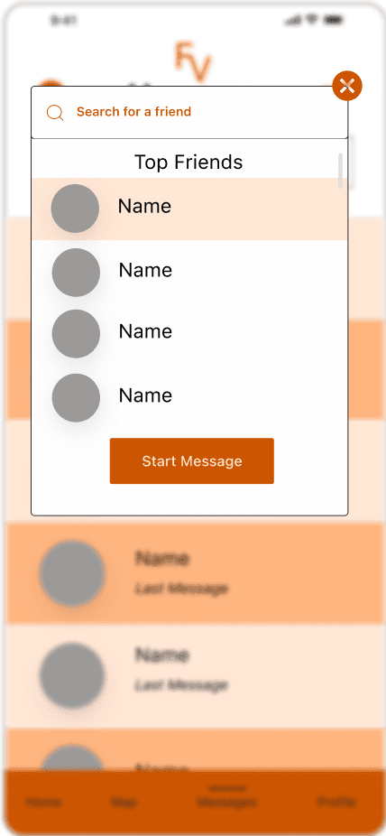
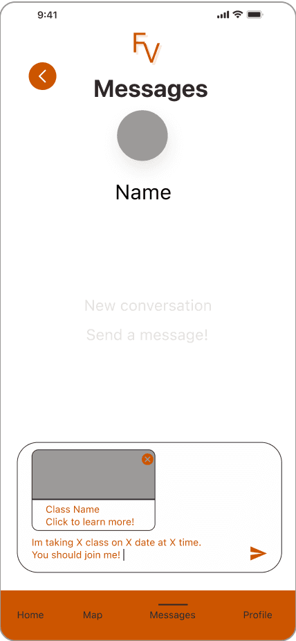
First user flow, Sending a Message, is the general messaging area where users can create new messages or continue existing ones. I wanted there to be a centralized place where people can access messages.
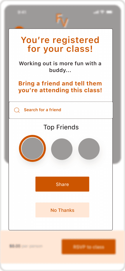
The second user flow, sharing RSVP for a class when the user signs up. Having the system prompt the sharing instead of the user seeking it out as a separate action is to help with retention rate and make it more intuitive for the user.
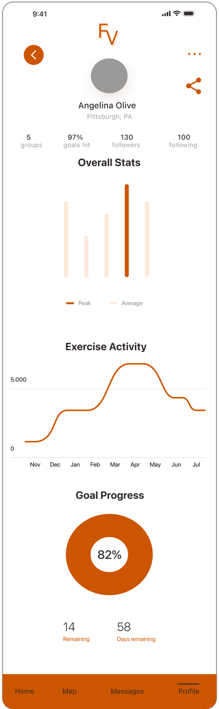
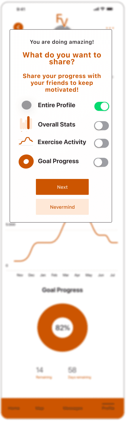
The final user flow is sharing progress. Since research showed the progress of one person can motivate another, I wanted an option for users to share their profile with others to show off their progress.
DEFINE

FEATURE WIREFRAMES
Sending New Message Screens
Sharing Class Sign Up Screens


Sharing Profile Screens
STARTING WIREFRAMES

Home Screen
Search Screen
Class Screen
Profile Screen
IDEATE
PROTOTYPE
TESTING
1
The new screen of customizing what pieces of your profile you could share with a friend was received very well in the second round of testing. Although, some users didn't see toggles working at first when selecting which aspects of their profile to share. To mitigate this, I enlarged the toggle icons so they are easier to tap.
2
Some users didn’t recognize the share icon since they have iPhones and iOS has a different share icon. After additional probing, users did recognize the share icon, there was just a delay. Users shared how it was just an odd placement next to the ellipse. Without knowing what all was going to belong to the ellipse, I moved the share button below it so it started creating a mini menu bar of icons users could use.
SECOND ROUND
FIRST ROUND
1
The ellipse button for sharing overall progress was difficult to select and not great placement for this feature. Some users did not know where to go on the profile page so I did direct some users. I ended up taking the share button out of the menu I created and left it at the top of the profile page.
2
When sharing a user’s sign up to a class, most users didn’t recognize the profile bubbles to choose which friend to share it with. I debated on adding the name at the bottom of the bubbles but I figured I’d start with one label at the top that said “Top Friends” to see if that would help.
3
Majority of users tried to create a new message by clicking on an existing message. Users were not seeing the typical create message icon in the top right corner. I ended up enlarging all the icons for consistency including the new message icon. I also added a label of “Existing Messages” at the top of messages to make it more clear.
REFLECTION
This was the second project using this design method which was nice to re-emphasize my knowledge of the components of each phase. Starting with screens at the beginning was a great exercise to simulate a client project. I was able to incorporate the reflection points I had from my first design case study which made the process more efficient. I think with this project I missed an opportunity to do some primary research. If I had more time I would have included that in my research phase to gain a deeper insight into the problem space. Overall, this project helps re-emphasize the knowledge I’ve learned and be able to test my skills in a different process than my previous design projects.
MORE WORK
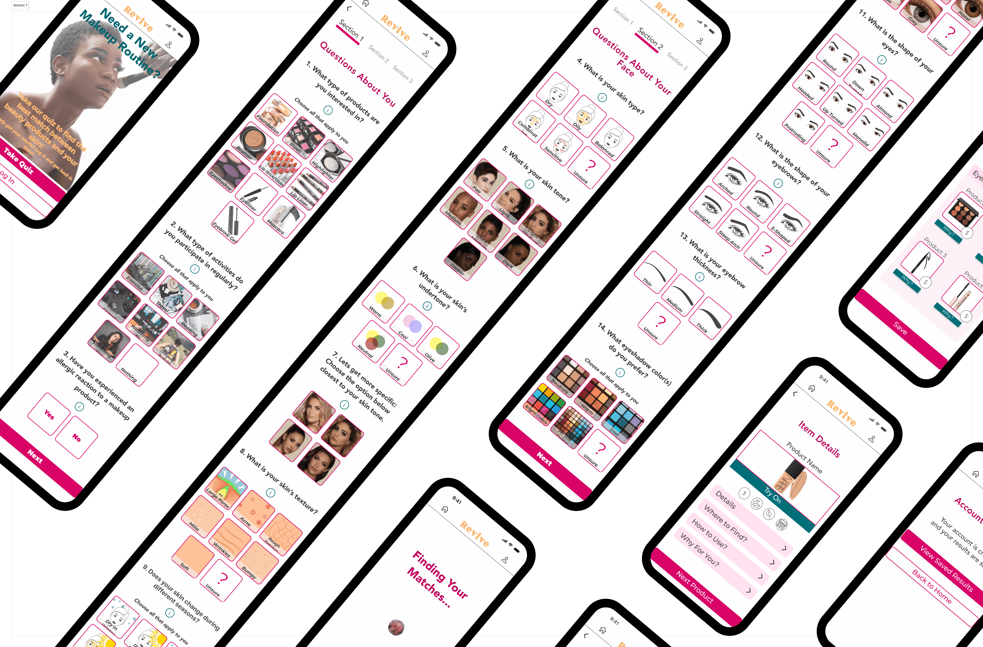
REVIVE

CITY PUPS