REVIVE
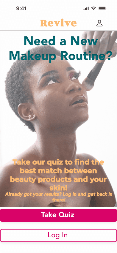


PROBLEM
There are so many options for makeup products, it’s become almost impossible to choose. This can be a highly stressful process for some users to navigate.
SOLUTION
Revive makeup app assists the user in finding all kind of products that match their skin. Once the results are in, you can look into the products further and learn more or virtually try them on.
My Role:
Research, User Flows, Sketching, Wireframing, Prototyping & Usability Testing
Tools:
Figma
Duration:
July 2022 - June 2023
For this solution, I utilized the design thinking methodology - Empathize, Define, Ideate, Prototype & Test.
EMPATHIZE
Performed secondary research to understand the problem space and developed a meaningful interview guide for my primary research. Five interviews were conducted around the topic of makeup and discussing the process women go through choosing the makeup products they purchase and use. Synthesizing the information further, I developed an affinity map that drew out these eight themes:
application
balance
trying new
learning
knowing your skin
social responsibility
research
convenience
DEFINE

The Minimalist
The primary persona for this design. Doesn’t wear a lot of makeup. Wants it to be easy & look complementary to her face

The Adventurer
The secondary persona for this design. Experiments with her makeup and different brands depending on what’s trending or addressing a new skin problem.
“Purchasing makeup is the most stressful thing about buying makeup... worrying about the quality or the way it turns out.”
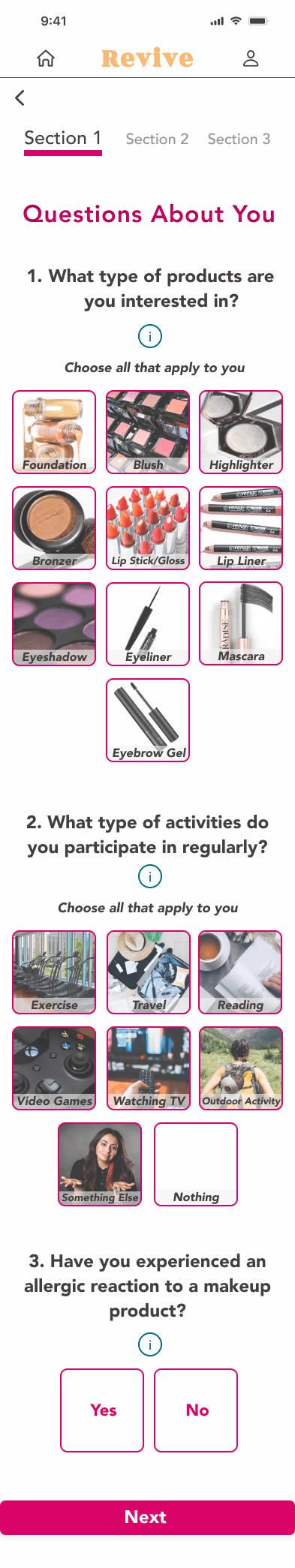
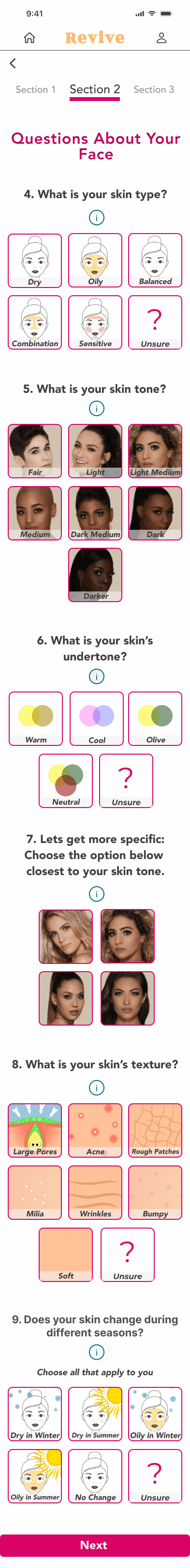
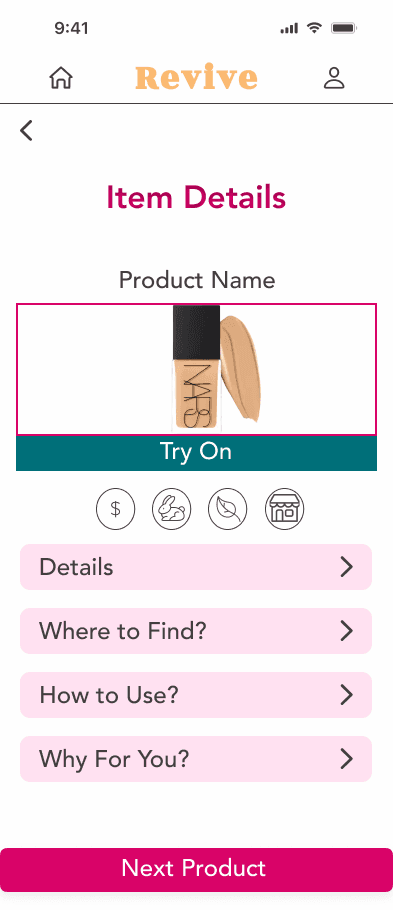
...TO WIREFRAMES


Sample Questionnaire Screen
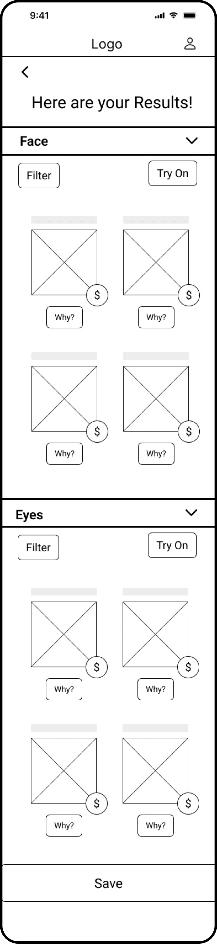
Results Screen
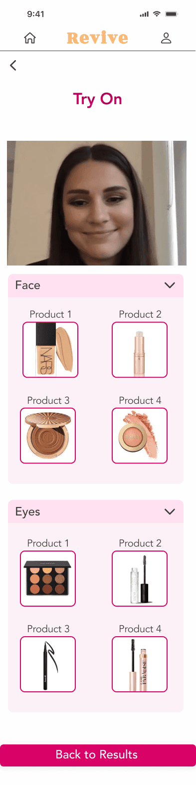
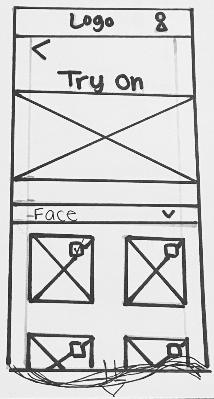
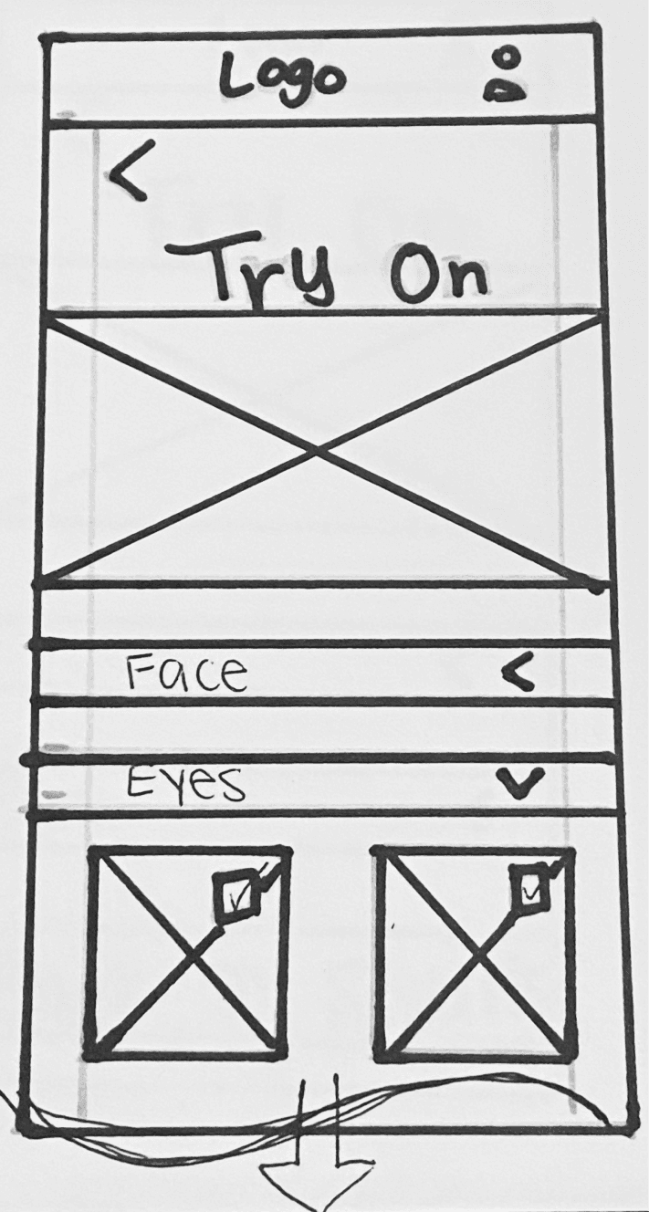
Try On Screen
FROM SKETCHES...


Sample Questionnaire Screen
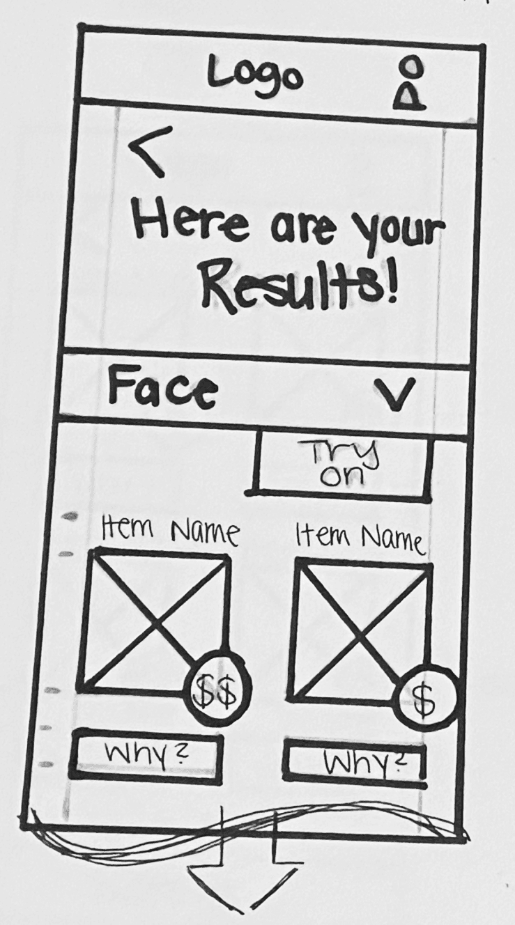
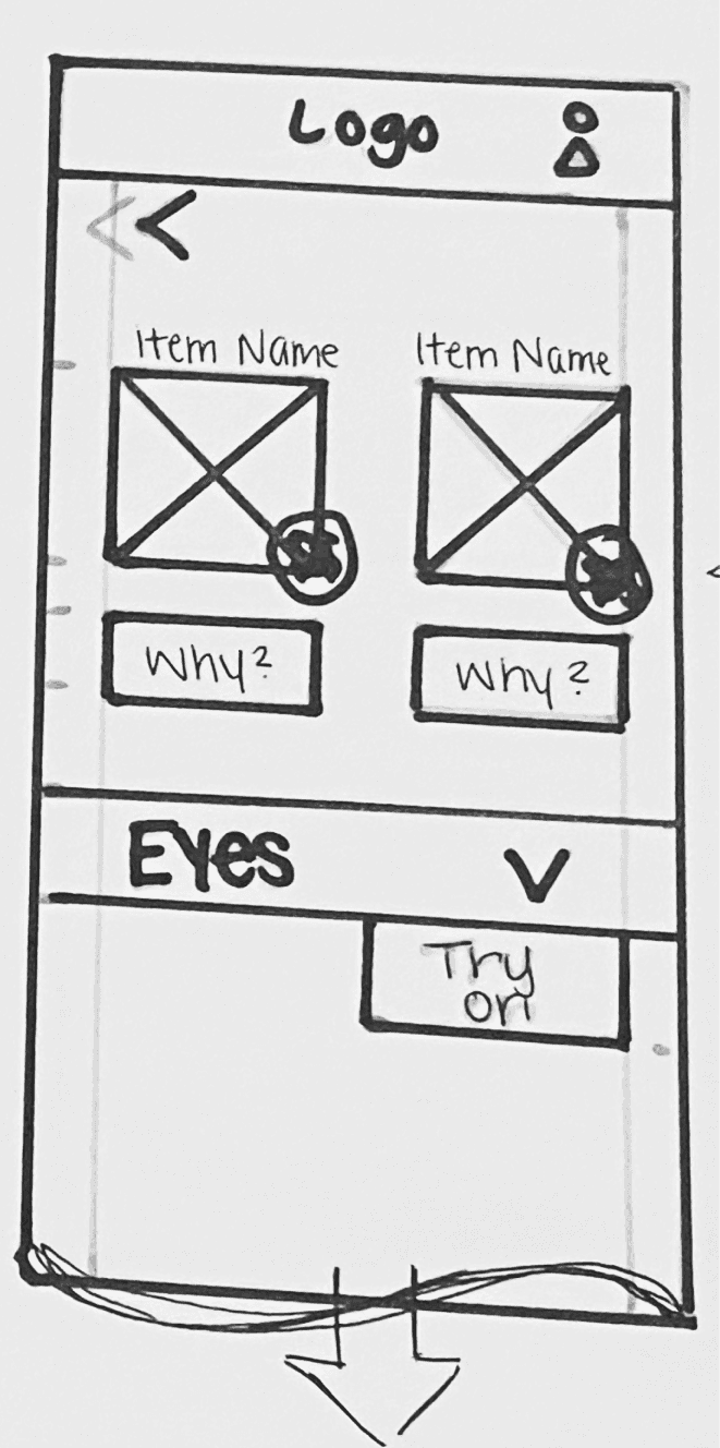
Results Screen
Sample Try On Screen
IDEATE
PROTOTYPE
TESTING
1
When trying on a product, it was unclear if the photo was selected or not when choosing a photo to upload. Added a layer to make it look like the photo was selected when the user taps on it. The Done button would then go from a light pink disabled state to an active button state.
2
Users clicked the header for the drop down sections instead of only the arrow on the Item Details page. I would expand the clickable area so that if the user clicks on any portion of the header or the arrow the section would expand or collapse depending on the previous state.
SECOND ROUND
FIRST ROUND
1
Changing the wording on the question option to Unsure from No Idea because no one was selecting that option. After some probing, they had some idea of an answer so they guessed the answer instead of selecting no idea.
2
Changed the UI of the results page and the try on product page to make it more user friendly and a bit more dynamic. Both pages were changed for consistency.
3
Made the layers on the try on photo a little more apparent since you couldn’t see the individual products that well. Users also liked the idea that the application was showing them where they should put the product on their face.
REFLECTION
This project was very eye opening in developing a solution from the start identifying a problem to the actual solution with the prototype. Within the design process there are a couple things I would do differently. First, I probably should spend a little more time brainstorming different variations of the functionality. I did have a learning curve with learning a new design software, Figma. Overall, this project taught me a lot and expanded my mind to the numerous solutions that could be developed for this problem and future problem statements.
MORE WORK
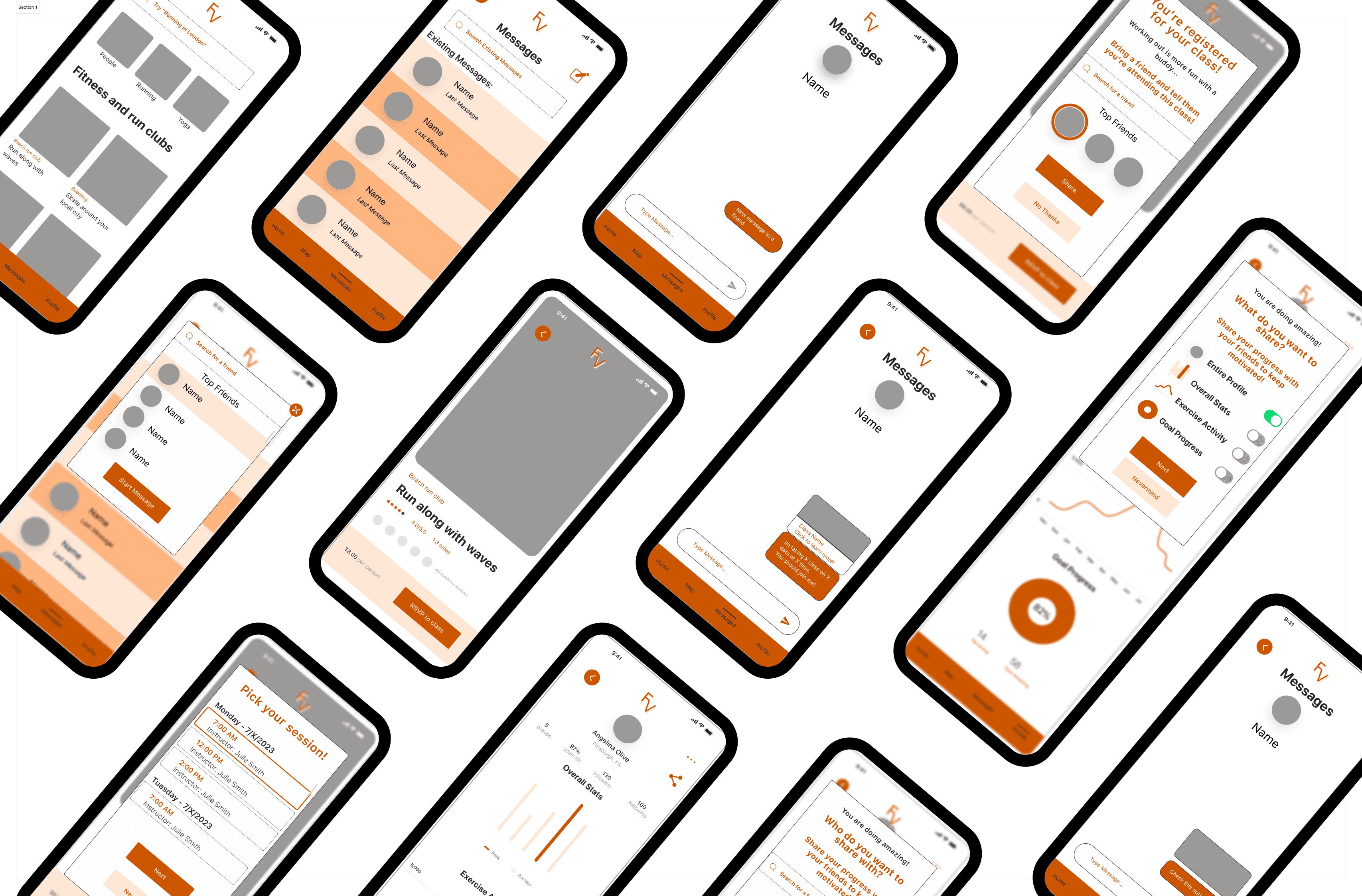
FITNESS VIBE

CITY PUPS